

Matelco’s new corporate identity
Since Matelco was founded in 1963, we have had a logo with which we have felt reflected and identified throughout this time. It has helped us to project our core business in the market, providing advanced technology equipment for automation and control of industrial processes . But more than 50 years have passed and it has become a necessity to adapt Matelco’s new corporate identity to today’s world. To a changing environment with very different realities. And for this, we have opted for a simpler and closer corporate identity that we wanted to reflect in the new Matelco logo.
New Matelco logo
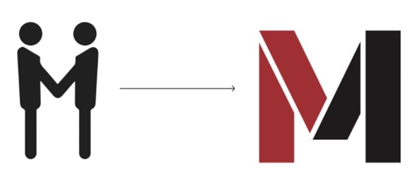
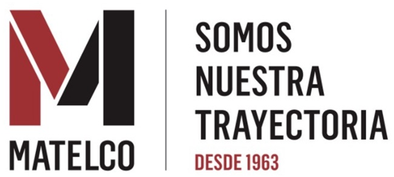
Our new logo maintains Matelco’s two original corporate colors (black and reddish). The main novelty lies in the change from a triangular shape to the current use of the Matelco M initial. This is now shown in two colors symbolizing a handshake between Matelco and our customers or technology partners. In essence, it represents a close and consolidated relationship.

New, more accessible, simple and intuitive website
With the launch of the new logo we also give a twist to our website. We implemented a digital identity that is coherent and consistent with the new identity. It is a new project that translates into an attractive web space. It reflects the new image defined with a simple and intuitive navigation, designed to meet the needs of our users on the network.
Matelco’s new website aims to be as accessible as possible. Also to meet the information needs of our customers and the latest developments in the industrial process automation sector.
To this end, new sections have been contemplated. As our success stories, a space that gathers the projects and innovative solutions that we have developed for some of our clients. Or the news section where we want to provide useful, relevant and attractive information about the sector.
To learn more about us you can visit our history and trajectory here. You can also easily get in touch with our experts in the contact section.